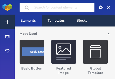
Visual Composer offers hundreds of different content elements that you can use to build your pages. There are 40+ predefined elements available right from the start. You can download more elements from the Visual Composer Hub.
All downloaded elements will be added to the element library and can be added to the page from the Add Content Window.
When working with elements, there is a simple concept you should understand. There are 2 types of elements:
- Structure elements (section, row, column)
- Content elements (text blocks, images, buttons)
Structure elements allow you to create the structure of your page. Your layout consists of rows divided into columns. Sections are used to combine rows.
You can place content elements into columns. In other words, fill columns with the content.
Rows and columns
A row is the root element of Visual Composer that can be divided into columns.
To divide a row into columns, you will need to adjust the "Row Layout" available in the row edit window. To access the row edit window, use row controls.
There is no limit in how many columns a row can contain. You can use percentage, fraction, and pixels to set column width. The maximum width of the row is 100%. This means having 50% and 50% columns will divide your row into 2 equal columns.
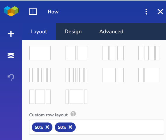 Since rows and columns are responsive, the width will adapt to different screen sizes.
To have fixed-width columns, you can use the pixel value. This is very useful if you don't want your column to reduce in width (ex. you have a logo image that you don't want to scale down on different devices).
Another value accepted by the "Row Layout" is "auto". The auto means that it will take all the free space available up to 100%. For example, if you set your row layout to 30% and auto - you will have two columns where the first one will take 30% of all width and the second the rest 70%.
It is allowed to have a row width that exceeds 100%. In such a case, columns that do not fit in will be moved to the down (stacking).
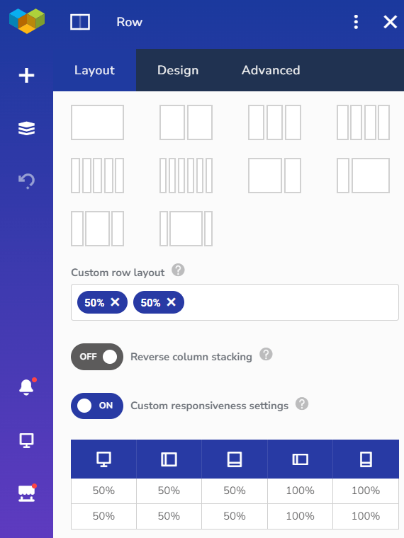 In addition to a simple row layout, you can adjust custom responsiveness. It allows you to adjust column width for specific devices or even hide parts of the content.
There are more controls available to rows that allow to stretch the content, set column height, column gap, content vertical position, and adjust advanced design options.
Content elements
Regular content elements that can be placed inside columns are the ones you will use to build your content. Elements like text block, single image, buttons, galleries, and more will contain your static content.
You can adjust the content and design of those elements from the element edit window.
There are simple elements and more advanced elements that can contain other elements (ex. button group containing multiple buttons or tabs that can contain other elements).
In addition, you can convert your static content elements into dynamic content elements. Dynamic content elements can display WordPress default fields and custom fields. To enable dynamic content, you will need to connect the element to the custom field.

Some elements, like post list or post grid, are dynamic by default. The purpose of those elements is to display dynamic content (ex. a list of your posts).
How to create your own elements?
Visual Composer allows adjust attributes of any element and save it as a preset.
To save an element as a preset:
- Add an element to the page and style it
- Click on the Settings" icon in the element edit window
- Name your element and click "Save as Preset"
- Your new element preset will be added to the Add Content Window
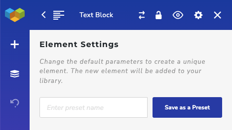
You can use presets when creating branded elements for your site or working on the site for your customers. Element presets can reduce the time you spend styling different elements.
For more advanced custom elements (not based on existing elements), you can use Visual Composer API. An API allows you to create completely custom elements for your projects or create addons for sale.
How to substitute elements?
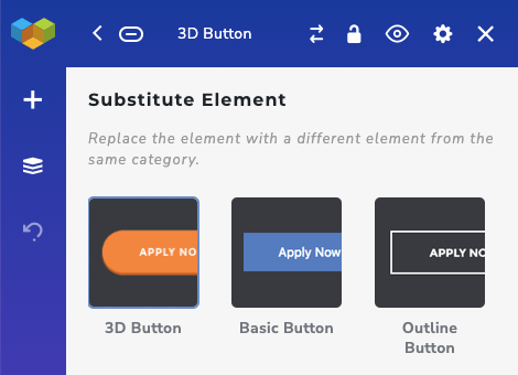
You can easily substitute elements from the same group while keeping the content of the element the same.
This allows you to quickly see how different elements look inside your layout (ex. how different buttons look).
To substitute an element with another one:
- Open element edit window
- Click on the substitute icon
- Select another element from the list
- The element will be substituted
How to hide elements?
You can hide any element of Visual Composer. This means that the element will still be available in the Frontend editor, but won't be visible to your site visitors.
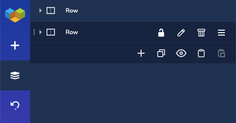
You can use the hide option to temporarily hide elements and enable them once needed.
To hide an element:
- Open element edit window
- Click on the "Eye" icon
- The element will be hidden
To unhide, perform the same steps.
How to rename elements?
Visual Composer allows giving your elements a custom name. That is very useful when working with large pages.
Naming elements allow you to quickly navigate through the layout to overview your content.
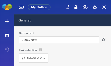
You can rename an element by clicking on the element title in the element edit window or in the Tree View.
