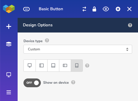
You can use responsive design options of any element (including rows and columns) to hide an element on different devices.
To hide an element:
- Open element edit window
- Scroll down to Design Options
- Select "Custom" under Device type
- Select device where you want to hide the element
- Set "Show on device" toggle to OFF

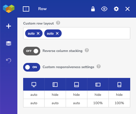
In addition, you can hide whole columns on specific devices with the responsive row layout.
To hide columns on different devices:
- Open row edit window
- Enable "Custom responsiveness settings" toggle
- Change the value of columns you want to hide to "hide"

